The Salty Otter, a new restaurant in Santa Cruz, California is facing backlash from locals—partially over its logo.
It’s not uncommon to hear about backlash when an established brand changes their logo (Jaguar, The Guitar Center, Cracker Barrel, etc etc etc). But it’s very surprising when it happens to a brand that isn’t even a year old.
What was the problem with the logo? It was generated by AI.
When a company like Jaguar changes its logo, especially when it falls under the same trend other big companies do (serif text, monochrome, little or no symbolism), the public is usually left scratching its head. Why change an iconic logo to a logo that looks the same as every other big company’s misguided attempts at minimalism or modernism?
But in The Salty Otter’s case, there have been some negative opinions over the restaurant’s use of AI.
“Their logo is AI generated, if they can’t make the effort to create a logo they definitely won’t make the effort to cook good food.” — Google review
“[W]hat’s up with the AI logo? Why not pay a local designer for a proper logo? Maybe then you would have used a sea otter instead of a river otter.” — Google review
“[T]he AI slop otter screams cheap and lacks in any kind of artistic taste.” — Yelp review
There’s probably a lot more talk about the Salty Otter going on in Santa Cruz than on Yelp and Google reviews, but out of ~150 reviews, the above quotes were the only ones I could find from 1 star reviews complaining about the logo. (The great majority of complaints revolve around server professionalism and the quality versus prices of menu items.)
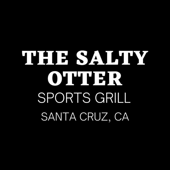
Regardless, the owner of the restaurant made an Instagram post in which she announced she was retiring the AI-generated logo for a white-on-black all-text logo in response to what felt like a group of locals who had crushed her dream.
(She goes on to say that she has experience in ‘computer graphic art’—which is all good and well, but with that experience maybe she would have benefitted from realizing how busy she already was as a restaurant owner and delegating/outsourcing her graphic design needs to someone who could put the appropriate amount of time and effort into the project.)
I’m sure that running a restaurant is hard, hard work. I’m also sure that public-facing businesses have to deal with a lot of criticism, and my intention is not to add to that burden. What I will say though, when experienced graphic designers and graduates just out of school are worried about AI taking over their place in the world, is that human design still matters. There are parts of the public savvy enough to spot AI-generated art and design, and they are pushing back against it.
The graphic design industry is maybe one of AIs first and most severely effected targets, but it’s still true that your branding represents your business, and who (or what) you get to create your branding matters as well.